Mildura Chocolate Company
Blick Creative
Graphic & Digital Designer
2018
Create a range of packaging of various sizes with a high quality feel that appeals to a wide variety of customers “from Toorak to Mildura” and promotes what people with a disability can achieve.
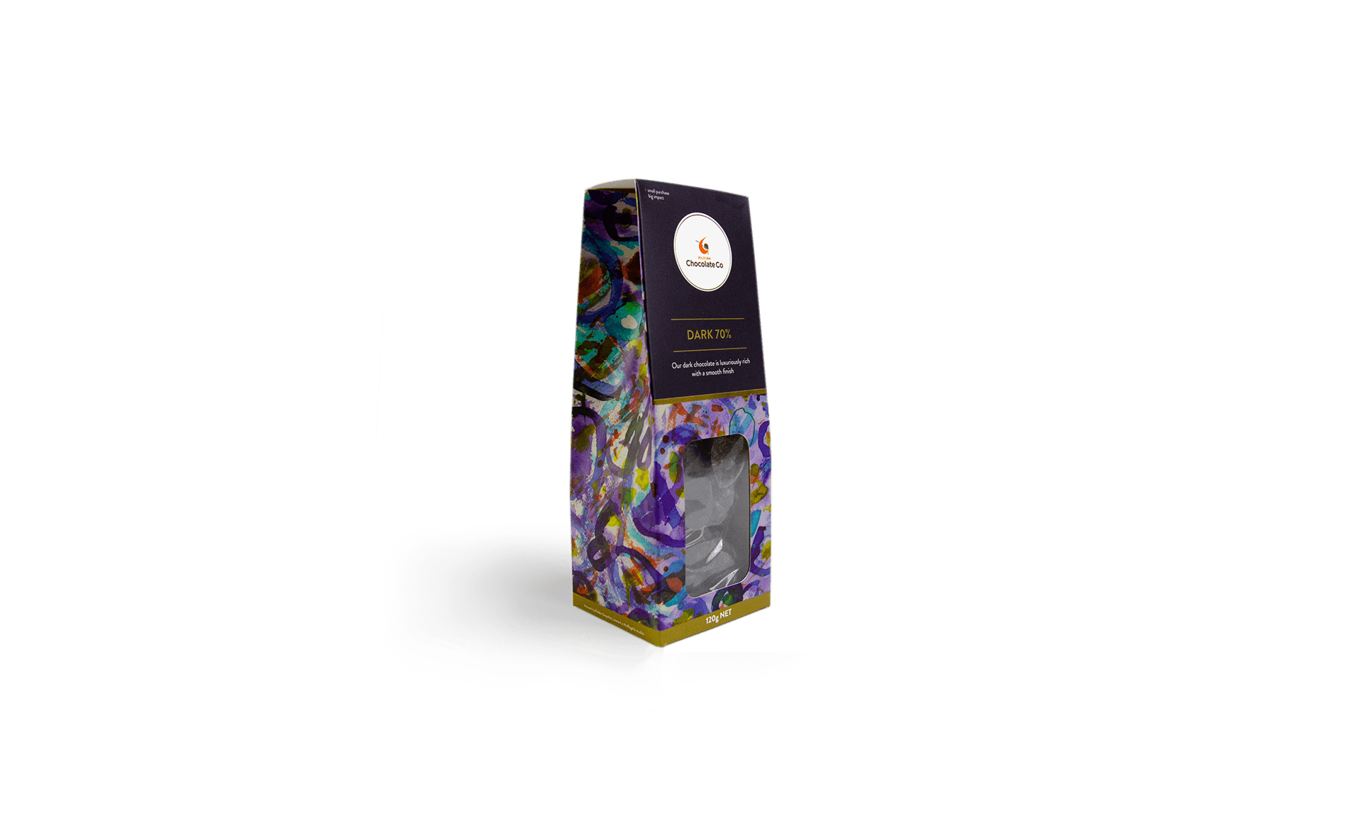
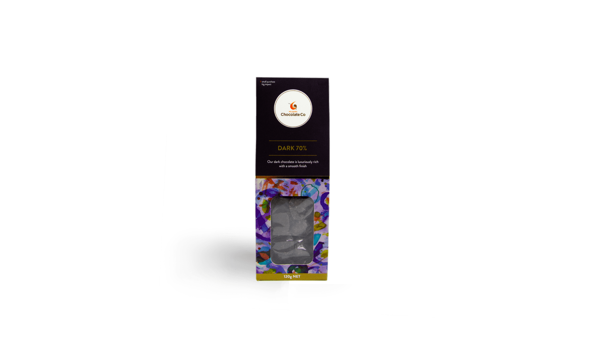
I wanted to create packaging that felt like it was designed to last, so I selected a thicker gauge of cardboard to ensure a premium feel. Incorporating a generous window with chunky borders confidently shows off the product whilst avoiding a flimsy look.
I based the visual design around colourful artworks created by the chocolatiers to put them front and centre, helping to showcase everything they can achieve. This is subtly complemented by the charcoal together with gold and white text, creating a classic look with an extra touch of class added by the metallic ink and foil strip.

