Category: Print

NICA

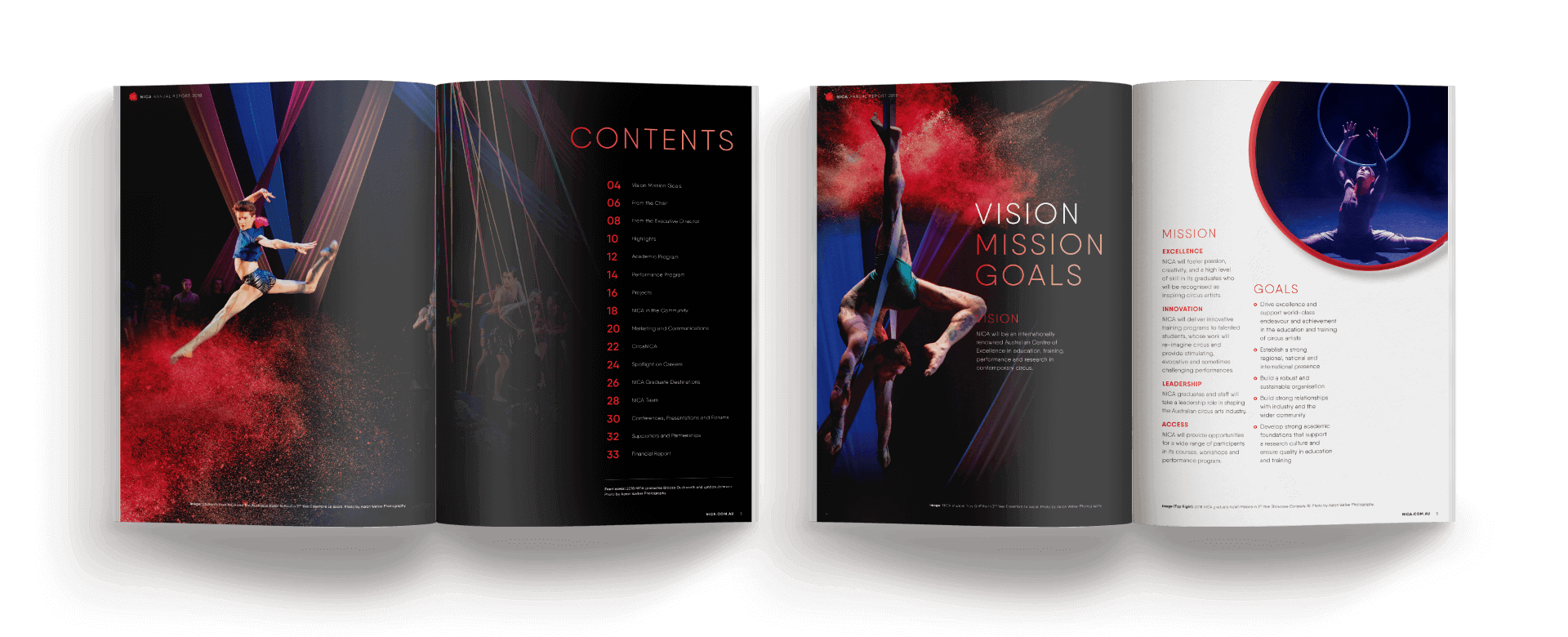
Create an annual report that projects the client’s progressive and playful side while maintaining a professional feel, which can be used to raise their profile and secure government funding.

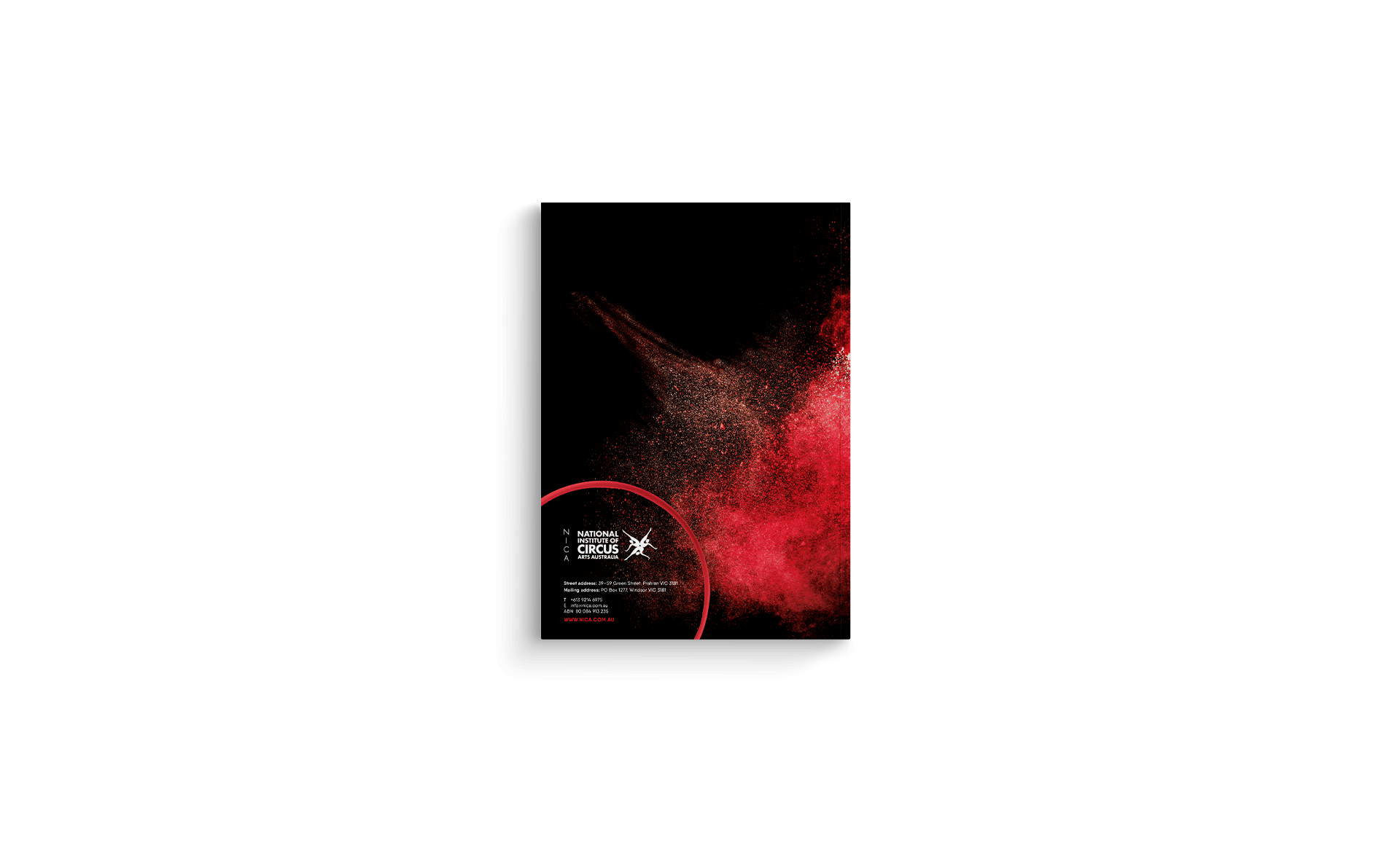
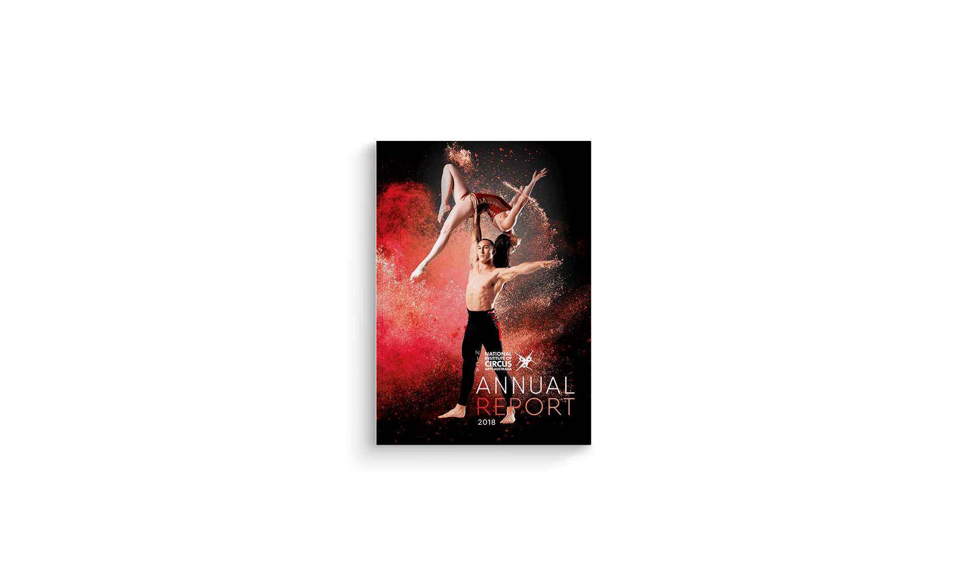
To achieve a slick first impression and evoke the excitement of the circus, I set the cover image on a black background complemented with an explosion of red powder. I carried this aesthetic throughout the report with feature pages utilising the same style. Professionalism is balanced with a sense of fun through the addition of red rings for visual interest and round images, both of which allude to the hoops used by performers at the circus.

ANZRP

Design an annual report that portrays a theme of marrying nature and technology together. The document needed to be professional and approachable with something unique to grab attention.

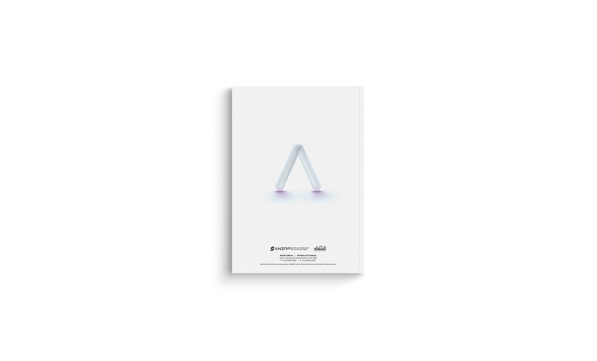
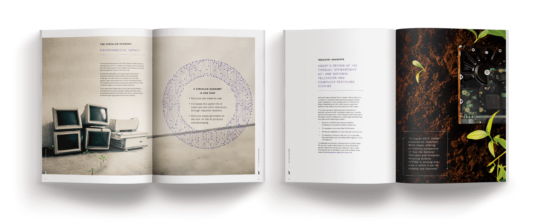
To capture the reader’s attention, I designed a cover dominated by glowing circuitry emerging from a laptop in the form of a tree — recognising the marriage of technology and the environment. I complimented this with green seedlings sprouting from paved ground, symbolising the re-emergence of nature within the built environment. This contrast of vibrant green plants with concrete or man-made technology is carried throughout the report along with the circuitry motif, which is used as an accent to highlight the pull out boxes.